01 / Logos
Our logo brings the name and mark together.
Choose the version that gives it room to stand out.
For everyday use



For single-colour use
Use these for single-colour print and black-and-white materials. Wherever colour is available, the brand-green logo takes precedence. Keep monochrome applications separate from green ones.



02 / Colours
Green leads, sand brings warmth, and neutrals give everything space.
Copy a HEX value to use it in your project.
Green / Primary
Primary 900
#0C3627 Primary 700
#1A412D Primary 500
#294E3B Primary 300
#488161 Primary 100
#96BFA5 Sand / Secondary
Secondary 900
#9C755A Secondary 500
#E3DACC Secondary 300
#F0ECE4 Secondary 100
#F9F7F3 Grays / Neutral
Neutral 900
#040404 Neutral 500
#5D5D5D Neutral 300
#C8C8C8 Neutral 100
#E8E8E8 Neutral 0
#FFFFFF Keep text contrast at 4.5:1 or higher. Use Primary 500 or darker behind white text.
03 / Gradients
Use the linear gradient on buttons and panels.
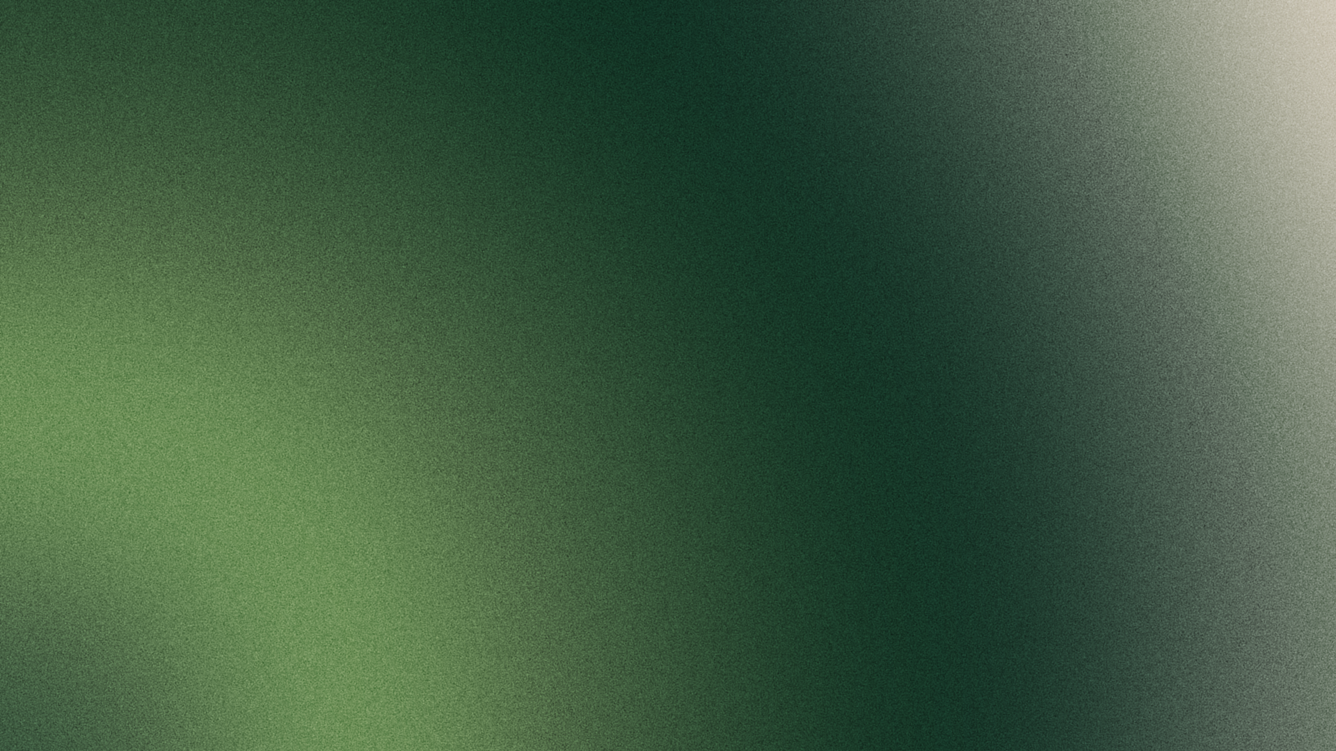
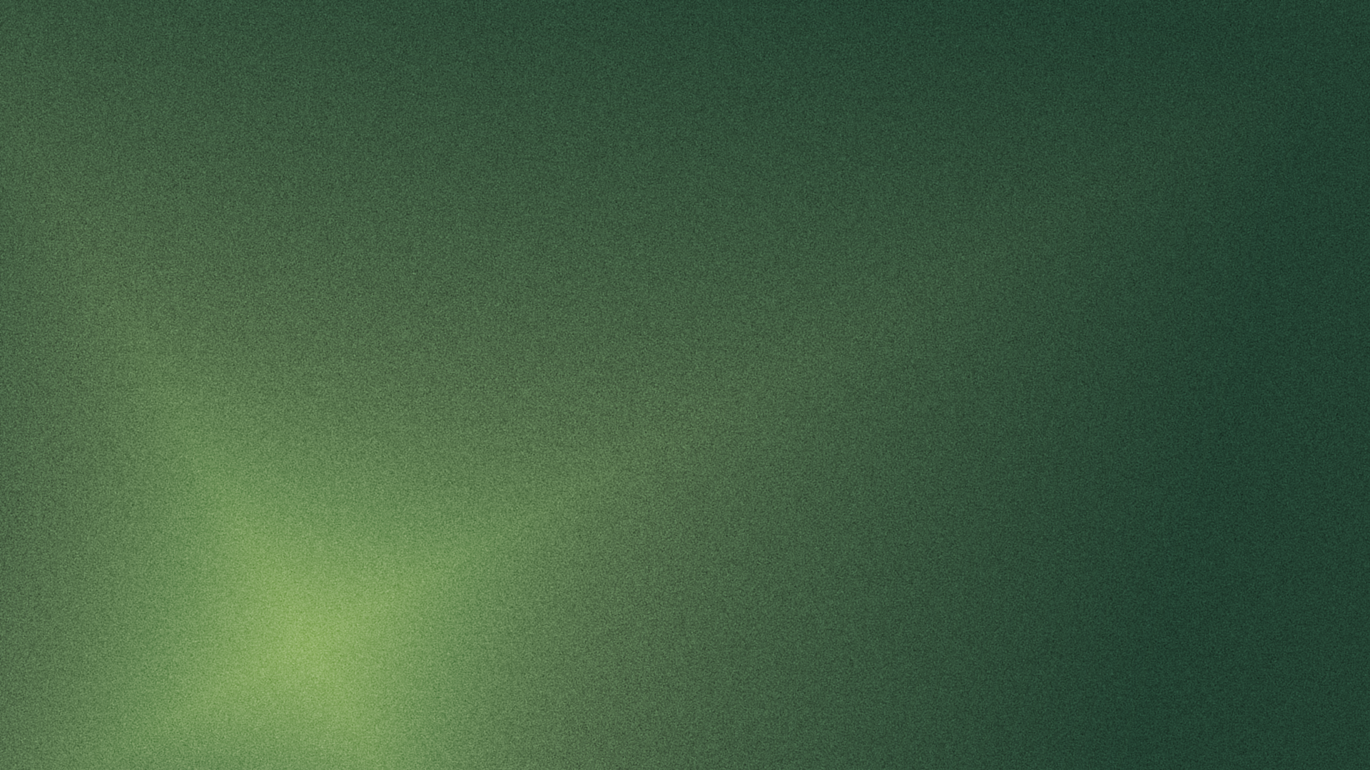
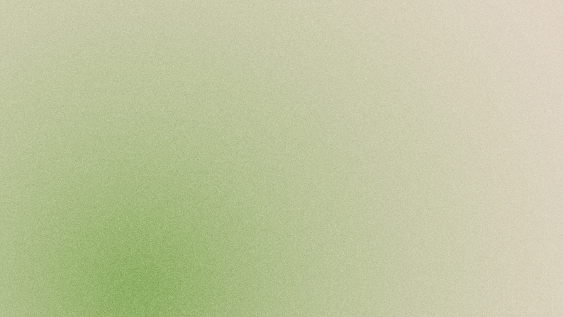
Our textured mesh gradients are made for covers, opening sections and social posts.
Brand linear gradient
linear-gradient(116.565deg, #488161, #0C3627) 
Mesh / Base
PNG · 1920 × 1080
Mesh / Version 1
PNG · 1920 × 1080
Mesh / Version 2
PNG · 1920 × 1080
Use the white logo on gradients and photography. Choose a placement with enough contrast for it to stay clear.
04 / Typography
Funnel Display gives our headlines their voice.
Inter keeps the everyday details easy to read.
Funnel Display
HeadingsA clearer way forward.
Aa Bb Cc 0123456789 Get the font
Inter
Body textGood advice starts with a clear conversation. We make the numbers easier to understand, so you can focus on what comes next.
Aa Bb Cc 0123456789 Get the font
05 / Usage
A few simple rules keep Numonis recognisable wherever it appears.
1×1× 1×1×
Clear space
Leave at least one mark-height of clear space on every side of the logo. Keep text, graphics and trim edges outside this area.
Minimum sizes
Horizontal logo: 120 px wide, or 32 mm in print. Use the mark for smaller spaces.
Brand mark: 24 px wide. For avatars, favicons and compact placements.
Keep the original
Use the supplied files. Do not change colours, proportions or shape, rotate the logo, add shadows or outlines, or redraw the mark.
Choose the right background
Use green on light surfaces and white on dark surfaces, gradients and photography. Give photos a green overlay of rgba(41,78,59,.16) or rgba(41,78,59,.32).
Making something with Numonis?
For brand questions or approval of a new application, get in touch with our team.